
Indoor signs
9/22/2020
If your storefront or office building has purchased enough commercial space for a parking lot, chances are you have the budget to provide ample parking lot signage. Still, restrictions and regulations abound for vehicle signage, especially since successful traffic control signs can prevent collisions and protect pedestrians from injury. So, while you may have the financial wherewithal to construct signs on every corner, whether they’ll be up to code is another matter entirely.
These rules and guidelines are in place for a reason. Safety, traffic facilitation, and posted information are better implemented using a uniform design language and a shared set of attributes.
What's more, the 2020 coronavirus pandemic has changed the way parking lots and other outdoor spaces communicate with customers and employees. Businesses must notify drivers of new access points and detours via wayfinding signage, enforce social distancing and safe hygiene best practices with floor graphics and a-frames, and communicate new operating practices such as curbside pickup and contactless delivery using yard signs, vehicle graphics and more.
To get a better idea of what you’ll run into during a signage audit of your parking lot signs in 2020, let’s go over the major rules and guidelines every company should follow.
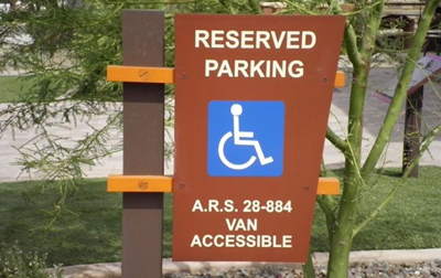
In 2020, many of the same parking rules outlined in the US government's 2010 ADA Standards still apply. In particular, we recommend following the parking lot guidelines put together by the United States Access Board. As part of their adherence to ADA (Americans with Disabilities Act), they’ve set up a list of standards for accessible design.
Regardless of your parking lot size, you must supply accessible parking spaces. The gradation starts with one accessible parking space per twenty-five regular spaces, until the total surpasses one-hundred. From there, requirements taper off gradually. Here is a full chart to show you how many accessible parking spaces you need depending on your parking lot size:
| Total Number of Parking Spaces in Parking Facility (Lot or Garage) | Minimum Total Number of Accessible Parking Spaces Required | Minimum Number of Van Accessible Sparking Spaces |
| 1 - 25 | 1 | 1 |
| 26 - 50 | 2 | 1 |
| 51 - 75 | 3 | 1 |
| 76 - 100 | 3 | 1 |
| 101 - 150 | 5 | 1 |
| 151 - 200 | 6 | 1 |
| 201 - 300 | 7 | 2 |
| 301 - 400 | 8 | 2 |
| 401 - 500 | 9 | 2 |
| 501 - 1000 | 2% of total | |
| 1001 and over | 20, plus 1 for each 100 (or fraction thereof) over 100 |
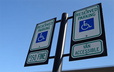
Yes, this means you’ll need a blue sign with a little white pictogram of a wheelchair on it (the character is called the International Symbol of Access, by the way). But there’s more to it than that. The bottom of your sign must be placed at a minimum of sixty inches above the ground to ensure visibility. Signs for van spaces should be clearly marked “van accessible.” Any further clarifications can be found in the ADA National Network's Factsheet on Accesible Parking Lot Signs.
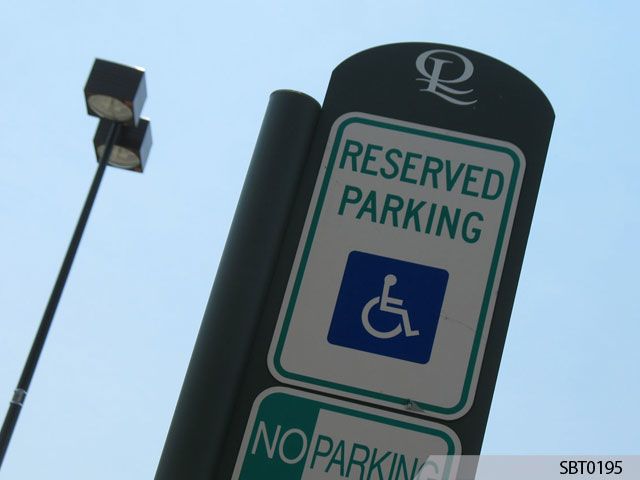
Reflectivity alone is not enough to illuminate parking lot signage and safeguard visibility. You’ll need to install overhead lamps, or another means of supplying light if you’re using a parking garage, to stay compliant.
Consult the IESNA (Illuminating Engineering Society of North America) for recommended standards in parking lot lighting. Generally, each LED parking lot light produces about 20,000 lumens from twenty-feet above.
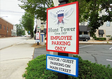 Assign each lot a color and a number. Not only does it help passersby and visitors remember the location of their vehicle, but it also allows your business to play with theme or branding.
For instance, signage for Lot 5 at a growing tech conglomerate might display a green background, as well as the insignia of a processor; Lot 4’s pole banners might showcase a blue background along with the silhouette of a water-cooling system.
As silly as this example may sound, small touches like this leave behind a lasting impression and communicate a company’s culture and values.
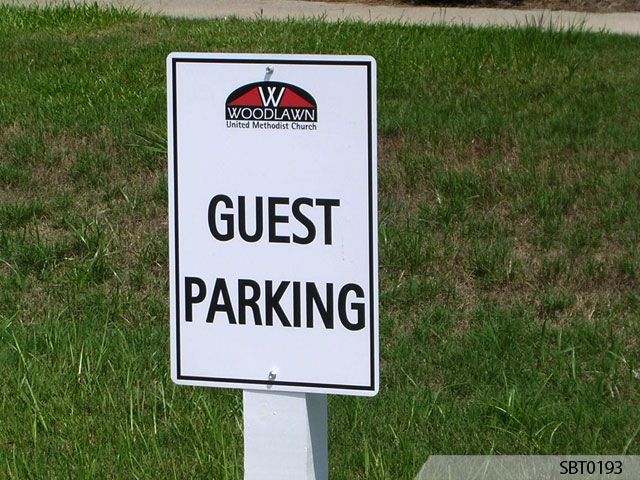
Don’t use text with a capital letter height of less than three inches. Motorists will be straining their eyes and holding on for dear life in their attempt to read your signs’ messaging.
That said, you can have a more fun with color coordination and font than you’d expect. Unlike street name signs and roadside signage, the MUTCD allows background colors to complement your building or campus.
Signs should always remain perpendicular to the intended viewer. Placing your parking lot signage at the wrong angle can confuse motorists coming from another direction.
Don’t let your plants, trees, and other natural sources of beauty get in the way of your signage! Always keep your parking lot well-maintained and regularly landscaped, so that drivers can read your signs.
For more professional tips and tricks involving parking lot signs, you can rely on the experts at Signs By Tomorrow®.
“What sign material will work best for my business?” you ask. Find out with an expert site assessment courtesy of Signs By Tomorrow®. We have a variety of for all applications and budgets. And if you’re looking for a lucrative addition to your parking lot signs, we offer We invite you to learn more about what Signs By Tomorrow can do for you. To get started, contact us.